There is a particular quality to the light on the first truly bright afternoon of spring. It falls across the dining table at a different angle, catching the rim of a glass, warming the grain of a linen runner, and suddenly the dark, layered look of winter feels not just heavy but genuinely wrong for the season. I always feel it, that quiet pull to strip things back, to let a little air in.
Spring hosting, at its best, is a conversation-first affair. The whole point of gathering adults around a well-set table is to let them talk, to pour something good, and to create an atmosphere that feels considered without feeling stiff. The table does that work. You don’t need complicated florals or an elaborate scheme, just the right foundation, a single jewel-tone accent, a warm metallic lift, and a centrepiece that sits low enough to actually see the person across from you.
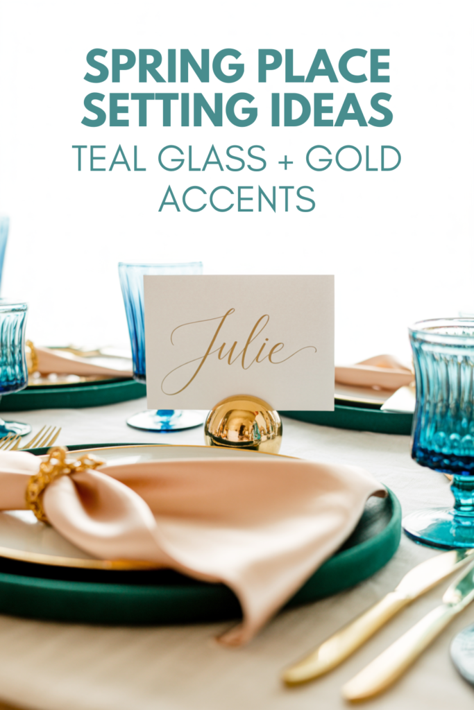
This is what I keep coming back to: a simple formula that looks genuinely expensive and takes under an hour to put together. You’ll want woven placemats, a cream linen runner, teal crystal goblets, gold charger plates, a marble tray, and a handful of bud vases. That’s the whole toolkit. Everything else is just restraint, and restraint, it turns out, is the most elegant choice of all.
On this page
The Natural Base: Woven Placemats and Neutral Linens
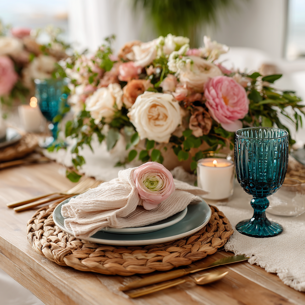
The base of most lovely spring tablescapes is the element most people underestimate, and the one that quietly determines whether the whole thing looks curated or just thrown together. For spring, I always start with texture rather than colour. Gloss and shine belong on the glassware and the hardware; the foundation should be matte, tactile, and quietly beautiful.
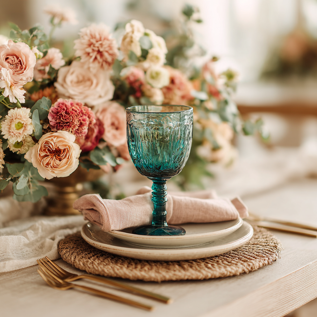
A set of woven placemats (I love a rattan charger for this, or a tightly woven natural fibre mat) gives the table an organic warmth without competing with anything placed on top of it. Layered beneath a cream linen runner, the effect is calm, grounded, and genuinely lovely in afternoon light. The key is keeping the pattern absolutely minimal here. One texture, one neutral tone, nothing printed, nothing fussy. When the base is this quiet, teal glassware placed on top of it practically glows.
For napkins, cream or the softest warm white are always my first choice, though I’ll sometimes bring in a single soft pink linen napkin per place setting for a whisper of warmth. Folded simply and slipped through a gold or natural fibre napkin ring, it looks considered without a moment of effort. My favourite trick is to press the napkins the evening before and fold them the morning of, so there’s nothing to fuss with when guests are due.
Quick Spring tablescape base checklist before you layer anything else:
Base texture (woven placemat or rattan charger) ✓
One neutral runner in cream or warm white ✓
Napkins in cream or soft pink with a simple ring ✓
Nothing tall on the table yet ✓
Layering Jewel Tones: Teal Glassware and Gold Charger Plates
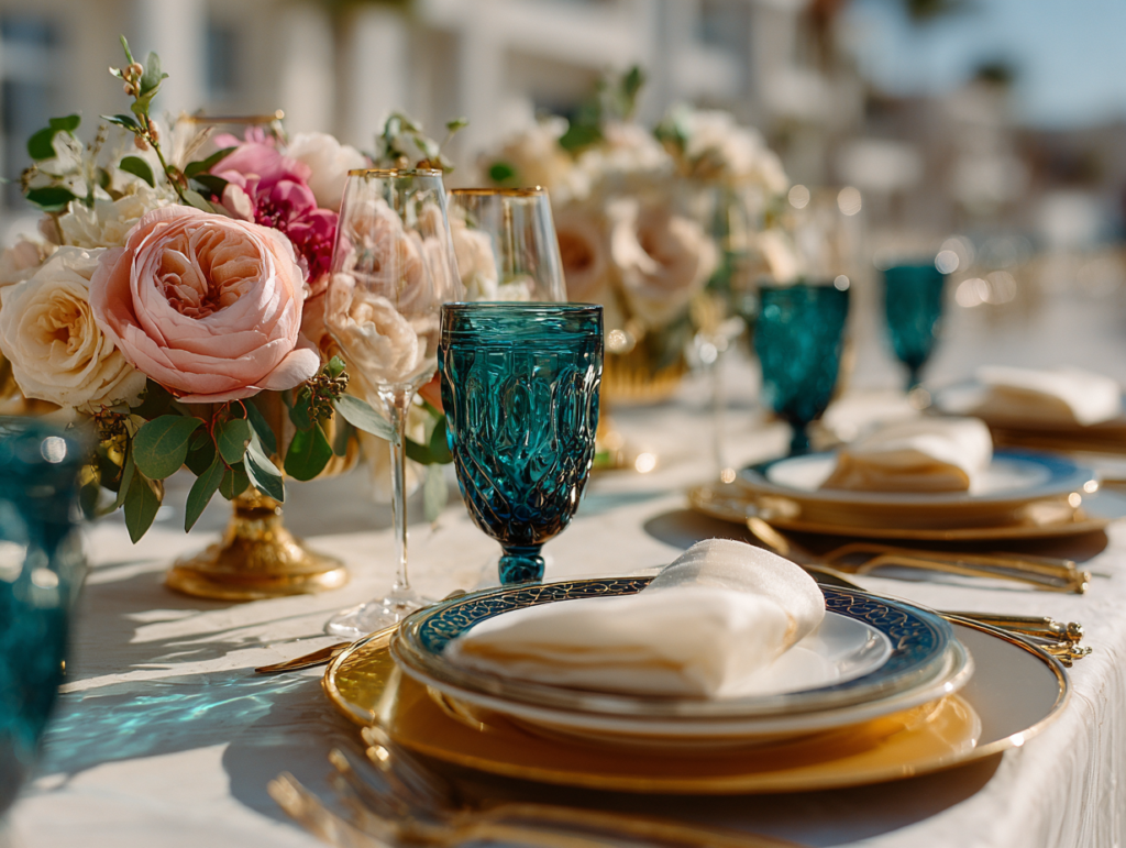
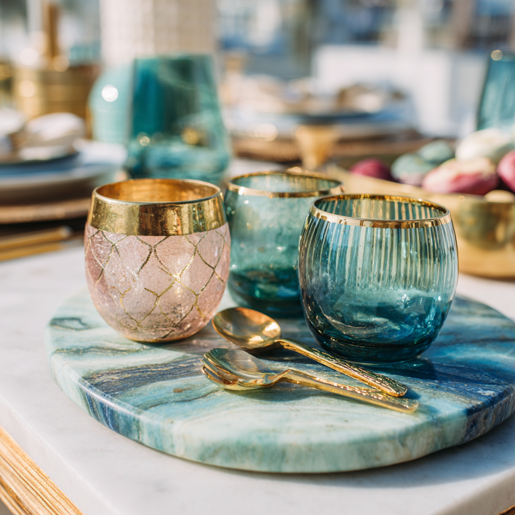
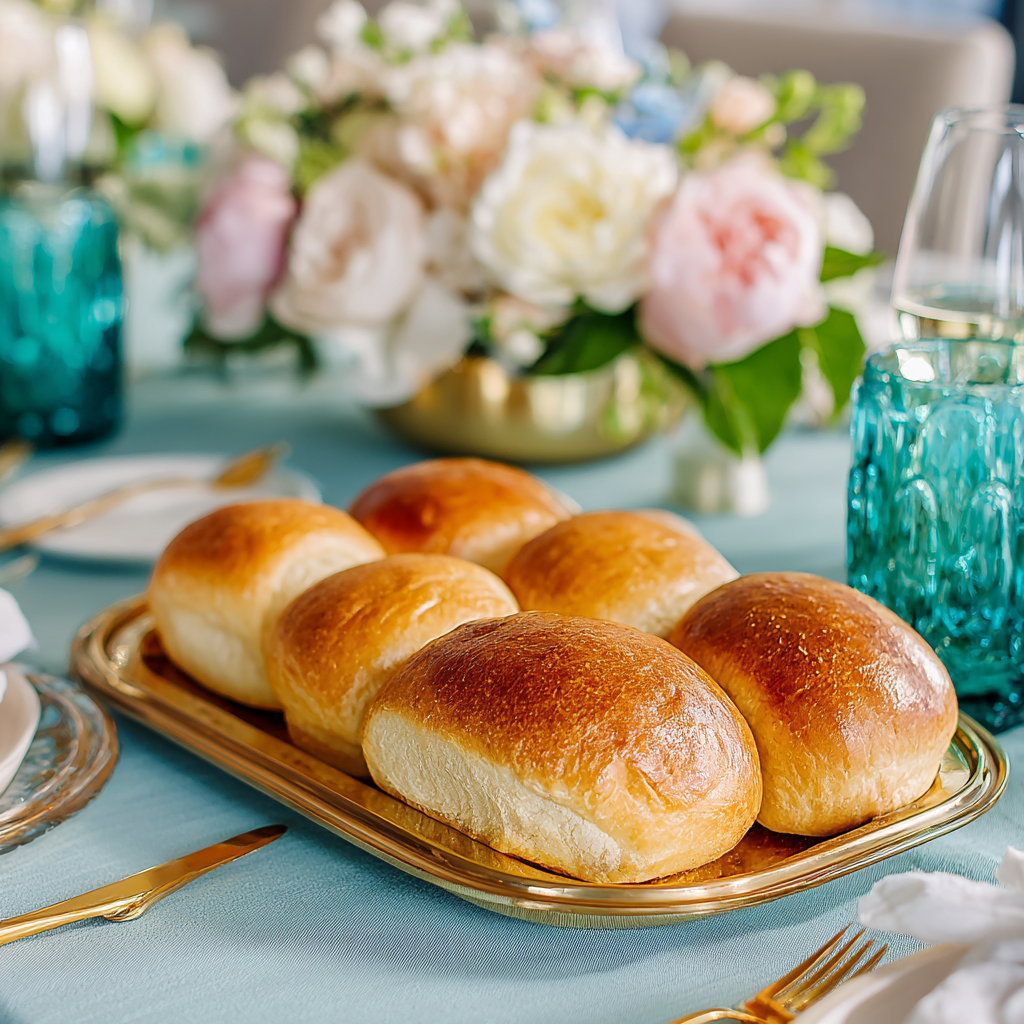
Coloured glassware is genuinely doing the heavy lifting in hosting styling right now, and I think that is exactly right. A set of teal crystal goblets placed on a quiet, textured base does more for a table’s atmosphere than almost any other single decision. The colour shifts as the light changes through the afternoon, deepening toward the end of an evening, catching candlelight or a low lamp in a way that feels quietly spectacular.
The pairing I keep returning to is teal glass with brushed gold flatware and gold charger plates. The warmth of the gold stops the teal from reading as cold, and together they produce that “quiet luxury” effect, the sense that someone has given this real thought without having made it complicated. Gold charger plates in particular are one of those purchases I always recommend to friends who host regularly. I swap out my everyday plates for a set of these and the table is immediately transformed, full stop.
If you want to add a tiny layer of polish, gold place card holders are a lovely touch for a seated dinner. They look intentional rather than fussy, they’re useful when you want to seat people deliberately, and they photograph beautifully for anyone who likes to document their tablescapes.
The guardrail I hold to firmly: one bold colour (teal) and one metal (gold), and then everything else stays restrained. Cream linens, clean surfaces, tidy edges. If I bring in any other colour at all, it’s a single soft pink, a napkin or a tiny bud vase, kept to the periphery rather than the centre of the table. The moment you introduce a third tone, the quiet luxury starts to tip into busy, and busy is the one thing spring tablescapes should never be.
Effortless Centrepieces: Low-Profile Bud Vases and Marble Trays
This is the section where I feel most strongly, because it’s the piece of advice I see ignored most often: the centrepiece must sit low. For an adult gathering where conversation is the point of the evening, a tall arrangement in the middle of the table is genuinely counterproductive. It blocks sightlines, it forces people to lean sideways to speak to each other, and it creates a visual clutter that works against every other calm, curated decision you’ve made.
Instead, I use bud vases, a multi-height glass set works beautifully here, clustered in a small group so that the tallest sits no higher than about 25 centimetres. The variance in height is what makes it interesting, that slight rhythm of short, medium, a little taller, rather than a row of identical vessels. Two or three stems per vase, nothing overflowing, nothing drooping over the edge of the table.
The piece that anchors the whole centrepiece and immediately signals a certain standard of hosting is a marble serving tray or marble cake stand placed beneath or beside the vases. Marble has that quality of looking expensive even when it isn’t, and it creates a defined “moment” on the table surface, a visual anchor that tells the eye where to rest. I always keep a set of gold serving tongs nearby as well, not just for practicality but because they look exactly right against the marble and the gold chargers, another warm metallic glint in the composition.
Keep the surface genuinely edited. Two or three bud vases, one marble piece, and that is it. Resist the temptation to add more. The negative space is part of the look.
The Finishing Details: Symmetry, Light, and the Look for Less
Once everything is placed, I take one step back from the table and look at it as a whole before a single guest arrives. Symmetry matters more than most people realise. It doesn’t mean the table needs to be perfectly mirrored, but each place setting should have the same elements in the same positions, and the centrepiece should sit at the visual centre rather than slightly adrift to one side. Tidy edges, napkins all folded the same way, glasses placed at a consistent height above each plate. These are the small details that make the overall effect feel expensive rather than approximate.
Ambient light is the other great ally of a spring tablescape. The goal is airy, reflective, and clean rather than dark and atmospheric. Good daylight is ideal, and if you’re hosting into the evening, a cluster of unscented candles or a warm-toned lamp at the side of the room will carry the glow of the gold and the sparkle of the teal glass beautifully without making the space feel dim.
The formula, when it works (and it reliably does), costs far less than it looks. Neutral base textiles from a high street homeware shop, a set of teal crystal goblets, gold charger plates, a marble tray you’ll use for years, and a handful of bud vases. None of it requires commitment to a single occasion. These pieces work together for spring, reassemble differently for summer, and live quietly in a cupboard without taking up much space. That’s the version of hosting I love most: beautiful without being excessive, considered without being complicated, and genuinely enjoyable for the person who set it all up.
I hope your table gives you more pleasure than stress this season. Pour something lovely, step back, and let the room do its work.